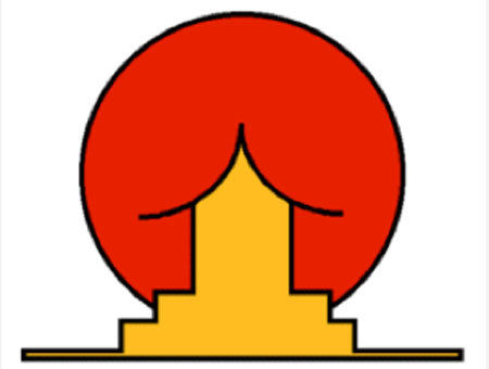
 can you see what we see? not good design!
|
 give me a break!
|
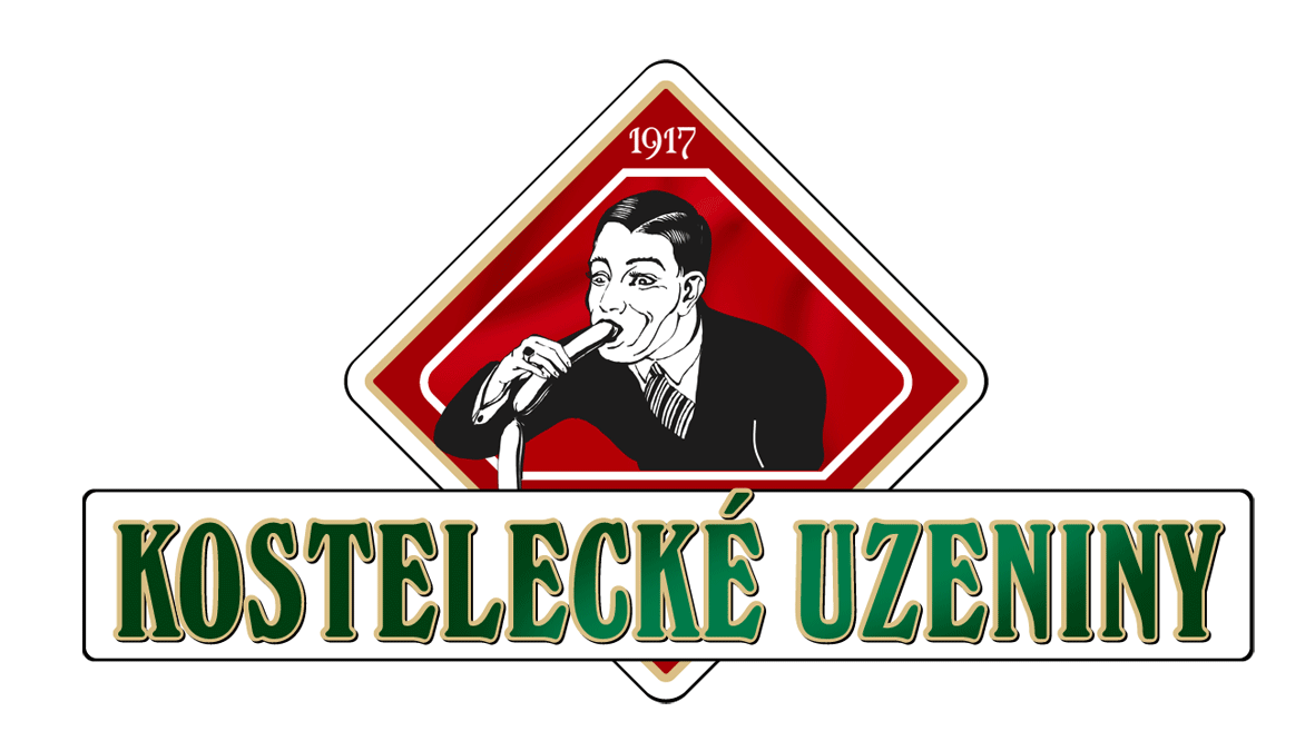 really?
|
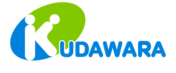 it doesn't take a sick mind to see what's going on in this logo
|
|
|
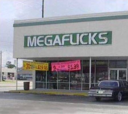 not what it looks like...
|
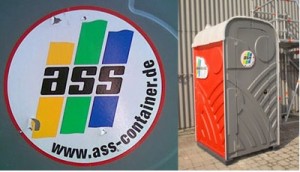 I don't care how appropriate the acronym is, don't use 'ass' in conjunction with the toilet!
|
 try reproducing this logo without the rainbow
|
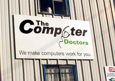 we fix failed hard drives, broken monitors and erectile dysfunction!
|
 the world's best search engine is stuck with an average at best logo. this unfortunate result is probably due to a rush to get the brilliant concept to market. another possibility is that it was designed by a programmer, which usually ends up looking like some of the 2s in our critique list. the name, google, is perfect for the concept, though the word was originally spelled googol. it is the word that represents the number 1 followed by 100 zeros. and the way they incorporated the pages of search results into the 'o's is genius, but the logo still suffers. the font is a basic palatino-esque font called catull, which has nothing altered to make it uniquely google. it's just the font. the simplicity matches the website style, but it doesn't say much for the designer. 3d effect is bad t
google.com
|
 Get your teeth cleaned and your sex on!
|
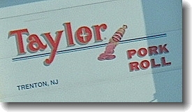 Cardinal Rule in Design: Never show the manufacture of sausage in your logo. Period.
|
 another brand that demonstrates the lack of early marketing planning is one of the nation's leading cell phone service providers. this beastly logo throws a silly and awkward v-shaped icon that doesn't match any other angles in the logo and it and is forced on top of a bland font that is graced with a repulsive red 'z' that extends below the logo and ends in a pathetic fade, which is evidently meant to demonstrate a horizon of some sort and reflect the icon that teeters above the logotype like a company about to collapse. verizon has a good name and really catchy marketing to work for its quality service, but the logo is unbearable.
|
 Have you ever heard of Highlight? I hope the answer is no, because incoherent “social” app has a logo that’s so horrible it will actually give you a headache. A physical headache, in your head. It’s dangerously bad.
|
 Pretty phenonemally horrible. Let's create a spy agency logo that has an octopus sucking the face of North America off. And the best thing is that you paid for it and it's being used to spy on you.
|
|
|
|
|
|
|
 is it just me but does this logo make it look like the building you're about to enter is cracking up and going to fall down and kill thousands of people?
|
 I'd hate to see how you solve my graphic problems
|
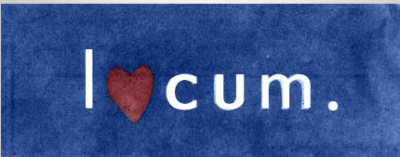 Yeah, sure you do.
|
 Looks like the healthcare.gov people designed this in MS Paint as directions to a hospital.
|
 yeah, some words don''t go together
|
 I don't care what the hell your little Chinese letters are saying, there's nothing that can explain that disgusting image you sick bastards
|
|
|
|
|
 Yeah, I get it, all the different languages make this puzzle and it all comes together because of you. That''s great. It''s a horrible logo. Simplicity is the ultimate sohpistication and Wikipedia''s logo ain''t got it. Try reproducing this in an icon or on a hat.
|
 It's like a more awkward sherman williams cover the world with paint but an hour glass. good concept but horrible followthrough
|
|
|
 barf
barf
|
 Is that an icon made out of rounded letter or is that logo just happy to see me?
|
 shes butterz sket
|
|
|
|
|
 i get it- it's a line, but it's hideous
|
 i was shocked when i learned that one of the great american graphic designers had designed one of the worst logos ever. the designer of such instantly classical logos as the ibm and ups logos, paul rand, also designed an instant stinker, the enron tilted 'e' logo. the logo looks like a kindergartner put it together. it's amazing that it's so basic yet so horrifically awkward. the wire image could have been pushed more in which case it could have been good, but there are inconsistencies with the font and icon as well as uneasy juxtapositions of color. the logo seems like more of a cruel joke for a company led by cruel people than a logo designed by a legend.
|
 or lisa simpson doing something improper to some abstract dude
|
 this looks like a doodle that some desktop designer drew and got some approval by a beureaucrat to move with it. what''s worse is that it probably cost taxpayers a million dollars and countless hours of government workers'' time. the designer probably saw a bunch of abstract logos and said, those look good, so i''ll do mine like that. problem is- those other abstract designs actually represent something. this represents absolutely nothing. horrible.
|
 really?
|
 I bet you get a lot of weird creepy old men coming to these classes
|
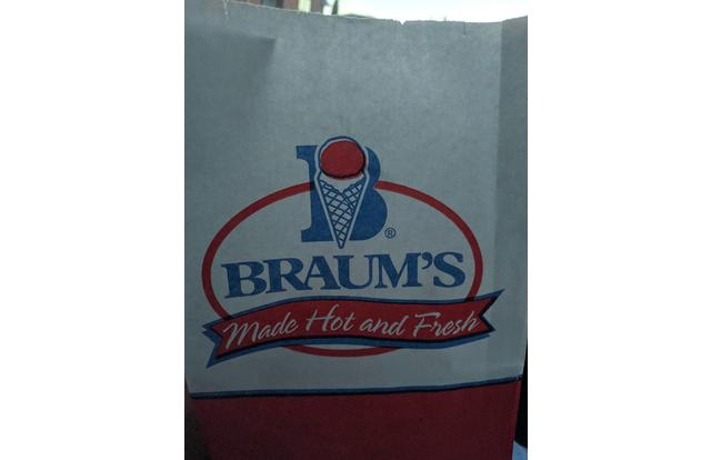 I would hope you don't make your ice cream hot and fresh!
|
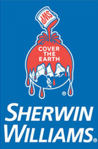 Coca-Cola wanted to teach the world to sing. Apparently Sherwin Williams wanted to cover the world in blood-red paint. The sinister "cover the earth" logo was adopted in 1906.
|
 There's a reason why all language is read top to bottom...
|